Available online ticket ordering websites have cluttered designs, inefficient systems for browsing through movies, and confusing checkout processes.
The goal
Design a Movie tickets website to be user friendly by providing clear navigation and offering a fast checkout process.
The product
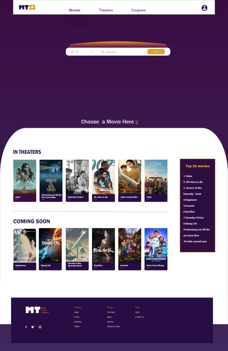
MT (Movie Tickets) is a ticket ordering platform that offers affordable hottest and various movie options. The typical user is between 19-40 years old, and most users are moviegoers including college students, early career professionals or young parents. Movie Tickets’ goal is to make ordering fun, fast, and easy for all types of users.
My role
UX designer leading the Tee’s Shirts website design
Responsibilities
Conducting interviews, paper and digital wireframing, low and high-fidelity prototyping, conducting usability studies, accounting for accessibility, iterating on designs and responsive design.
Understanding the user
Pain points
1.IA
Ticket ordering websites designs don’t provide a easy way to see the nearby theaters in distance order.
2. Interaction
There are too much information to distract attention on the search page and search bar.
3. Snack ordering
Online ticket ordering websites don’t provide an snack order buttons to choose.
4. Ticket getting
The Ticket Vending Machines waste customers’ time to input long numbers to get the paper tickets.
Persona & problem statement
Persona : Miya
Miya is a busy software engineer, who needs movie and theater search filters, and snack button ,because they want online ticket ordering more easy and fast.
User journey map
I created a user journey map of Miya’s experience using the site to help identify possible pain points and improvement opportunities.
Starting the design
Sitemap
Difficulty with theater lists on website was a primary pain point for users, so I used that knowledge to create a sitemap. My goal here was to make strategic information architecture decisions that would improve overall website ticket ordering process. The structure I chose was designed to make things simple and easy.
Paper wireframes
Next, I sketched out paper wireframes for each screen in my app, keeping the user pain points about easy and fast way to find movies in the search page , then browsing, and checkout flow in mind.
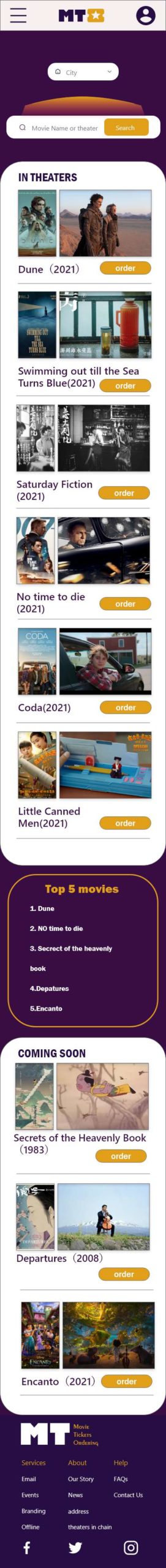
The home screen paper wireframe variations to the right focus on optimizing the browsing experience for users.
screen size variation(s)
Because movie ticket ordering’s customers access the site on a variety of different devices, I started to work on designs for additional screen sizes to make sure the site would be fully responsive.
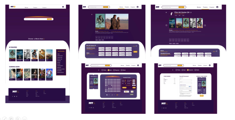
Digital wireframes
Moving from paper to digital wireframes made it easy to understand how the redesign could help address user pain points and improve the user experience.
Prioritizing search bar and visual element placement on the home page was a key part of my strategy.
screen size variation(s)
screen size variation(s)
Low-fidelity prototype
To create a low-fidelity prototype, I connected all of the screens involved in the primary user flow of adding an snack button ,QC code and checking out.At this point, I had received feedback on my designs from members of my team about things like snack buttons and the payment page. I made sure to listen to their feedback, and I implemented several suggestions in places that addressed user pain points.
On the ticket number page ,users found it toublesome to click the numer again ,because the default number is zero.
2.Text link
On the homepage movie part, after click the movie title , users found it couldn’t link to movie page
3.Checkout
During the payment process, userd wanted to confirm the cost detail again before input the paymeng password.
Refine the design
Mockups
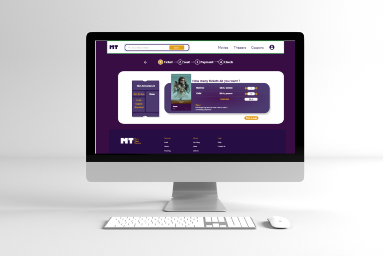
Based on the insights from the usability study, I made changes to improve the site’s ticket flow. One of the changes I made was setting the ticket number as 1 . This allowed users more easy to choose the ticket number without click the button again.
To make the checkout flow more clear for users, I added a pop-out window that allowed users to confirm the ticket information before paying.
Accessibility considerations
1. High contrast color
I used high contrast color to design for clear visual recognition.
2.Headings
I used headings with different sized text for clear visual hierarchy
3.Landmarks
I used landmarks to help users navigate the site, including users who rely on assistive technologies
High-fidelity prototype
The high-fidelity prototype followed the same user flow as the low-fidelity prototype, including design changes made after the usability study.
Our target users shared that the design was intuitive to click the ticket, more easy and fast to find the very movie and theater, and demonstrated a clear visual hierarchy.
What I learned
I learned that even a small design change can have a huge impact on the user experience. The most important takeaway for me is to always focus on the real needs of the user when coming up with design ideas and solutions.
Next steps
1.Research
Conduct follow-up usability testing on the new website
2.New input way
Identify any additional areas of need and ideate on new features