We create this Audio-tour app for the art galleries.
The gallery wants to offer more detail information for the customers to get better experience. This App targets customers like family groups who want to explore the art work details.
Overview
The problem
Family group customers lack the detailed knowledge to take a close look at the artworks.
The goal
Design an app for art gallery that allows users to easily get the detail information and enjoy the tour of gallery.
My role
UX designer designing an audio-tour app for the Art Gallery from conception to delivery
Responsibilities
Conducting interviews, paper and digital wireframing, low and high-fidelity prototyping, conducting usability studies, accounting for accessibility, and iterating on designs.
Understanding the user
Summary
I conducted interviews and created empathy maps to understand the users I’m designing for and their needs. A primary user group identified through research was family adults who are eager for art detailed knowledge to share with family members.
This user group confirmed initial assumptions about Art Gallery customers, but research also revealed that family groups was not the only factor pushing users to long for art detailed knowledge .
Other user problems included buying tickets and keepsakes, or challenges that make it difficult to get the right routes and artwork
Pain points
1.Information
Customers don’t know much about the art detailed information.
2.Accessbility
Artwork audios are not equipped with assistive technologies
3.IA
Text-heavy information in artworks is often difficult to find and read
Persona & Problem statement
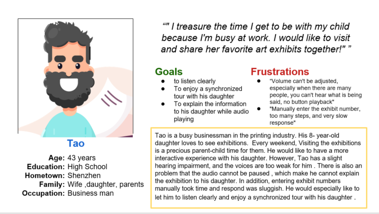
Tao is a busy and hearing impairment father who needs easy access to audio-tour information because he has little information to share with his daughter.
User journey map
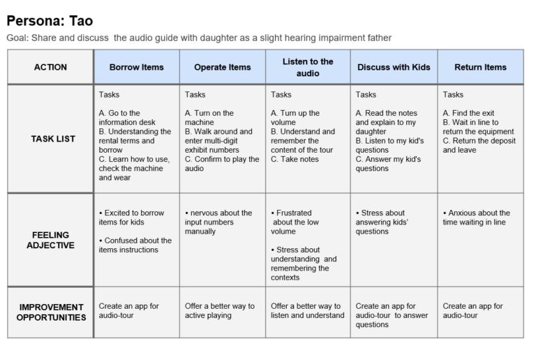
Mapping Tao’s user journey revealed how helpful it would be for users to have access to a dedicated Audio-tour app.
Starting
the design
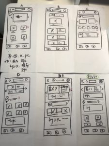
Paper wireframes
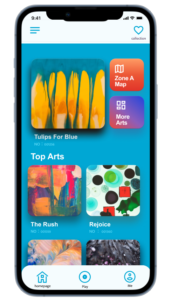
Taking the time to draft iterations of each screen of the app on paper ensured that the elements that made it to digital wireframes would be well-suited to address user pain points. For the home screen, I prioritized a right and easy finding process to help users get the artwork’s information .
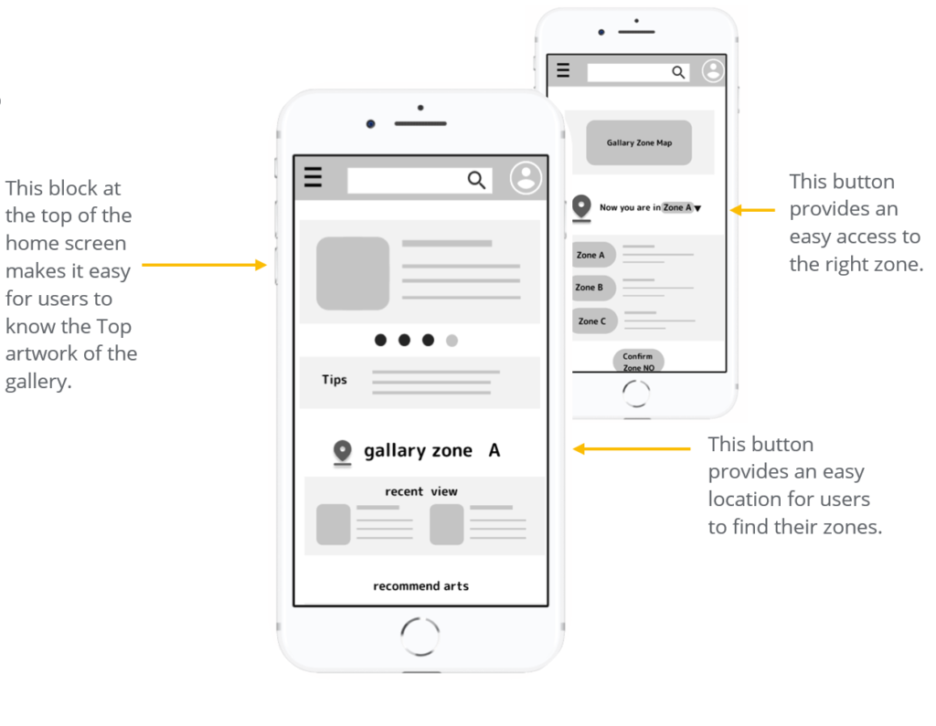
Digital wireframes
As the initial design phase continued, I made sure to base screen designs on feedback and findings from the user research.
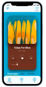
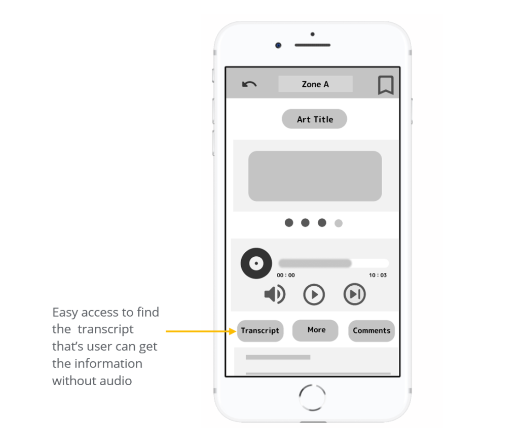
Transcript was a key user need to address in the designs in addition to equipping the app to work with assistive technologies.
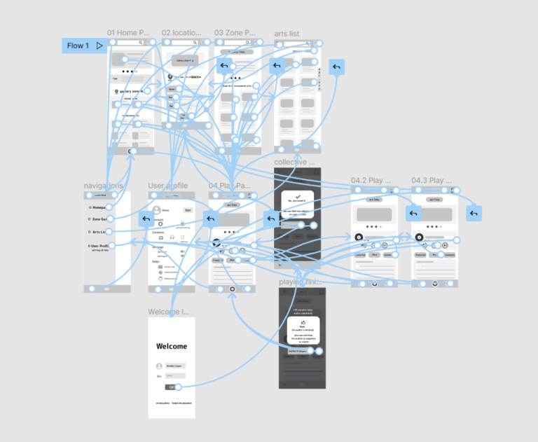
Low-fidelity prototype
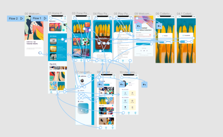
Using the completed set of digital wireframes, I created a low-fidelity prototype. The primary user flow I connected was finding the zone , playing an audio, and collecting the favorite audios so the prototype could be used in a usability study.
I conducted two rounds of usability studies. Findings from the first study helped guide the designs from wireframes to mockups. The second study used a high-fidelity prototype and revealed what aspects of the mockups needed refining.
Round 1 findings
1. Entry
more intuitive way to access to entry Zone A
2. Collection icon
Change the collection icon familiar and name it
3. Back menu button
Make the “back menu button” more attractive
Round 2 findings
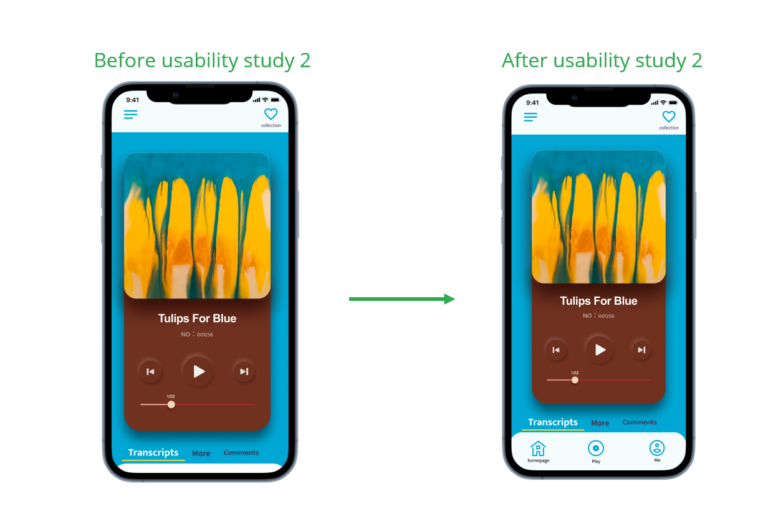
1. Titles
Make the titles have same interaction as the picture
2. Bottom navigation
Make bottom navigation fixed shown without scrolling
3. Text
More explanation text on the login page after collection
Refining
the design
Mockups
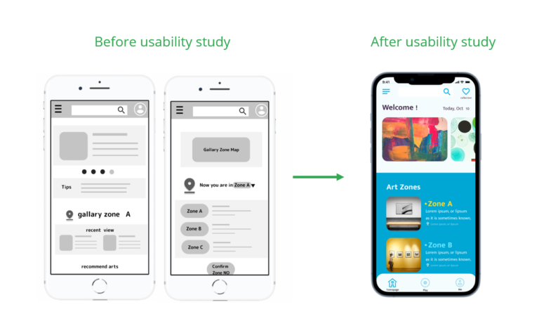
Early designs allowed for auto recocation for 2 screen, but after the usability studies , I integrated the two pages into one , and put the Zone list on first screen so that users can see the zones at the first sight no matter their GPS is good or bad.
The second usability study revealed frustration with the back navigation to the homepage, so I narrowed the play panel a little and fixed the bottom navigation banner to this screen.
Accessibility considerations
1.Transcript
Transcript are shown in the player panel ,so that it’s another way to get the information.
2.High contrast
The color theme is high color contrast, so that users can see the information clearly.
3.Large fonts
Large fonts , icons with texts help people to understand the menu easily.
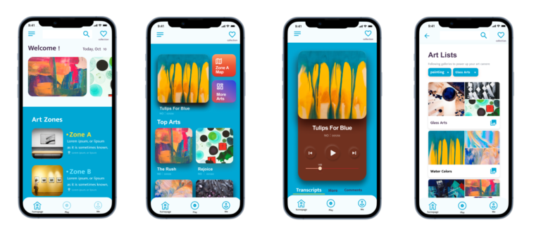
High-fidelity prototype
The final high-fidelity prototype presented cleaner user flow for listening the very one audio. It also met user needs for collecting their favorite audio and exploring more art information.
The app makes users feel like Art Gallery really thinks about how to meet their needs.
One quote from peer feedback:
“The app made it so easy and fun to watch the artworks! I would definitely use this app as a guide for a joyful tour.”
What I learned
While designing the audio-tour app, I learned that iteration based on user’s feed back is so important . The Usability is most related to the designer’s level ,not the users’ ability.
Next steps
1. New usability study
Conduct another round of usability studies to validate whether the pain points users experienced have been effectively addressed.
2. New need
Conduct more user research to determine any new areas of need, such as location the painting with more quick and easy way, or the needs of recommend routes.