Lots of Adults must take pills on time nearly everyday. The strategy team at Pill Reminder has identified a lack of easy process to set pill’s intaking time and limited notifications for adults to know whether their family members have taken pill on time.
The goal
Design an app that will improve the reminders of various pills’ intaking and help adults to check the situation of their family members’ pill intaking on time.
The product
Pill Reminder is a Medical organization focused on pill intaking. The organization needs a tool that helps adults remember medicine on time. Pill Reminders’ primary target users include retired men and adults who are concerned with their parents’ pill intaking and would like to learn more about what they can do to remember to take pills on time.
My role
UX designer leading the app and responsive website design from conception to delivery
Responsibilities
Conducting interviews, paper and digital wireframing, low and high-fidelity prototyping, conducting usability studies, accounting for accessibility, iterating on designs, determining information architecture, and responsive design.
Understanding the user
Persona & problem statement
Persona 1 : Dahai
Dahai is a retired man who needs repeat reminders, voice instruction, delivery medicine home,because they want to keep healthy to enjoy old friends’ meetup
Persona 2 : Yili
Yili is Busy accountant.who needs notifications that whether parents take medicine on time properly and lack of medicine, buy medicine in an easy way.because they must make sure that parents intake situation
Competitive audit
An audit of a few competitor’s products provided direction on gaps and opportunities to address with the Pill Reminder app.
Starting the design
Ideation
I did a quick ideation exercise to come up with ideas for how to address gaps identified in the competitive audit. My focus was specifically on repeated reminders and pills intaking tracking for family members.
Digital wireframes
After ideating and drafting some paper wireframes, I created the initial designs for the Pill Reminder app. These designs focused on repeated reminder and tips to help them remember.
Low-fidelity prototype
To prepare for usability testing, I created a low-fidelity prototype that connected the user flow of add a medicine and check out the pills situation
These were the main findings uncovered by the usability study:
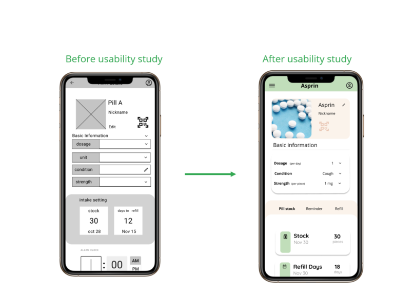
1.Units
People need better cues for what the stock number and refill number mean
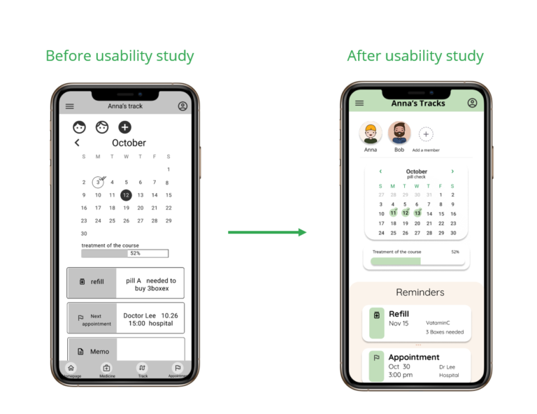
2.Back button
People need a more intuitive way to access to the main pages not just a back button
3.Calendar
People need better cues to understand the check calendar means
Refine the design
Mockups
Based on the insights from the usability studies, I applied design changes like adding units behind the numbers to clear the numbers mean ,and changing the hamburger menu instead of back button to give a more intuitive way to access homepage.
Additional design changes included adding an title to calendar providing a clearer indication of what the calendar and ticked dates mean.
Accessibility considerations
1.Screen Readers
Clear labels for interactive elements that can be read by screen readers.
2.Headings
The homepage uses a big and black fonts to let users recognize the reminder easily.
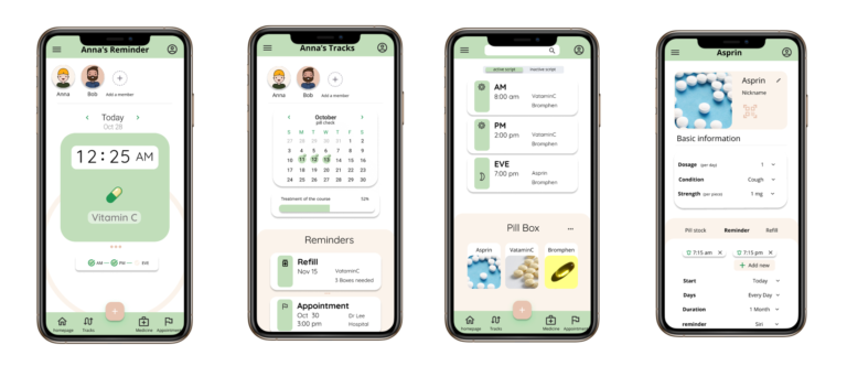
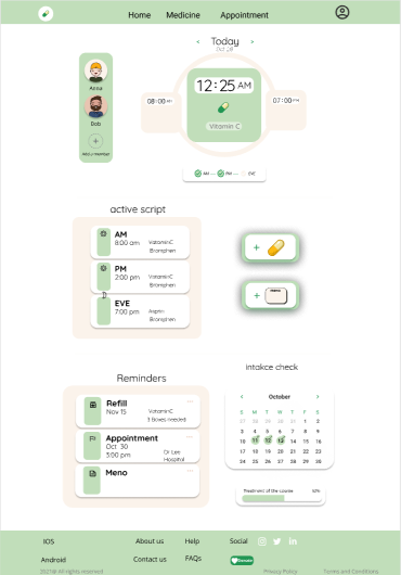
High-fidelity prototype
The high-fidelity prototype followed the same user flow as the low-fidelity prototype, including design changes made after the usability study.
With the app designs completed, I started work on designing the responsive website. I used the Pill Reminder sitemap to guide the organizational structure of each screen’s design to ensure a cohesive and consistent experience across devices.
Responsive designs
The designs for screen size variation included mobile, tablet, and desktop. I optimized the designs to fit specific user needs of each device and screen size.
Mobile website
Tablet
Desktop
Going forward
Takeaways
Impact
Users shared that the app made the pill taking seem like something they could actually help reminder.
One quote from peer feedback was that “the Pill reminder app helps reduce the pressure both of parents and family members .”that’s is an easy reminder to take pills”
What I learned
I learned that we should put the user in the center during designing ,and give users more clear texts and clues what the functions use for ,usability test is critical to let us jump from our circle, and listen to them, aligning with specific user needs helped me come up with solutions that were both feasible and useful.
Next steps
1.Research
Conduct research on how successful the app is in reaching the goal to add various medicines.
2.New input way
Add a scanning or automatic way to input the pill information.
3.Notiofication
Provide circle an alarm notification when older parents missed the pill ,family members can remind them in person